How Consultative Selling Can Help Your Business

No comments

Almost every organization has their own sales methodology. It may not have a name and your sales team may not follow its tenets religiously, but there’s likely a methodology present if you look closely.

So, after thinking about it for a moment, how does your team sell?

If there’s little method to the madness, let us suggest a methodology that could help convert more of those leads into ironclad sales: consultative selling.

For those plugged into the business community over the last few decades, this term will likely sound familiar. The phrase first hit the scene back in the 1970s with the publication of the book Consultative Selling: The Hanan Formula for High-Margin Sales at High Levels, penned by author Mark Hanan.

While the concept has been around for the better part of forty years, its overarching principles still hold significant value when applied to the sales process.

So, what does consultative selling look like and how can it help your organization meet its sales goals?

Defining Consultative Selling

The primary principle that makes consultative selling different from other sales approach is its staunch focus on the customer and their needs.

HubSpot aptly describes this concept: “The consultative sales process is primarily focused on the experience that the potential customer (the lead) feels and sees during their interactions with you. It’s about the how you find ways to provide your leads with value and make it all about them. Not your product, your business, your numbers. The consultative sales process is most especially not about you.”

Essentially, the focus is entirely on the customer’s pain points and needs rather than hawking a product or service. While this may seem counterintuitive at first glance, selling solutions to your leads is a softer (and often more effective) approach. And that’s the first way it can broadly help your business.

Placing the Focus on Solutions

Consultative sales is also commonly known as solution sales. And that’s exactly what sales people are now working toward — learning a customer’s issues, and selling them your product or service based on how it can meet their needs.

That inverts many sales processes. Rather than browbeating customers to buy into your product or service through elevator pitches or long sales speeches, you listen to their pain points. Sales people must listen first and then offer genuine insights. Offering canned answers to customers will make sales people come off as disingenuous. But truly listening and offering tailored tools based on what you’re hearing often encourages leads to take the leap and invest. When they feel you’ve invested the time to get to know their needs, they may be more likely to invest their dollars in your solution.

Sales People Become Experts

When sales people are assisting customers and listening to their concerns, it’s crucial to know the company’s product/service inside and out. You can’t effectively offer what your company sells as a solution if you don’t know the ins and outs of your product.

Through the consultative selling process, your sales people are forced to become experts on your company and what it sells. And having a plethora of product experts on hand is never, ever a negative thing.

Better Align Products With Customer Needs

When this selling method is implemented properly, your organization will have access to a wealth of data on prospects. You’ll have a clear idea of the wants, needs and pain points of your ideal customer (and what that ideal customer looks like from a demographic standpoint).

When the sales team is constantly receiving customer feedback on what they’re looking for, it’s far easier to pass that feedback back to managers.

And in the spirit of continuous improvement, business leadership can realign product offerings or create new services that better meet the needs of the customers you’re targeting. Whether that’s changing marketing tactics, tweaking branding or brainstorming new services that help customers.

The Bottom Line

Consultative selling, when implemented properly, obviously has numerous benefits. The aforementioned reasons are just a few of the ways businesses can profit from this concept.

If your sales team is on the prowl for a new sales methodology, consultative selling is worth considering.


read more
ExhaleMarketingHow Consultative Selling Can Help Your Business

Extracting Real ROI From Your Content

No comments

In today’s tough business environment, it’s not enough to be a market leader — positioning an organization as a thought leader is integral to build awareness and buy in for your brand.

One way to achieve that goal of providing thought leadership is through a well-defined content marketing strategy. As a publisher of unique content relevant to your customers, companies can create a real impact on both their brand and their bottom line.

But sometimes it’s truly difficult to connect content — even thorough, well-written pieces — with tangible results that help build your brand. This is where a well-defined content marketing strategy comes into play.

Rather than simply keeping your fingers crossed that your latest blog post goes viral, let’s broaden your definition of success and tailor it to your goals. Here are a few key steps to ensure you’re extracting the most ROI from your content.

Establish a Strategy

According to the Content Marketing Institute, an abysmally low number of B2B marketers have a content marketing strategy in place: only 35 per cent bother to create one at all.

But creating a whack of content without a defined strategy is just as random and senseless as throwing spaghetti at a wall to see if it sticks. Publishing and promoting content that may not resonate with your particular audience is a waste of time, effort and precious marketing budget.

Sit down and put it on paper. This document should cover goals and set data benchmarks, outline current and prospective audiences, summarize the breadth of topics any content will cover and how content will be promoted.

Fleshing out this strategy with measurable goals, consistent messaging and an efficient workflow will help ensure those marketing dollars are funneled toward more effective content initiatives.

Study the Right Data

After you’ve drafted your content and set up your campaigns based on your strategy, how do you know what’s working?

In your strategy, it’s helpful to identify your preferred outcomes and how you intend to measure any progress toward those goals. Are you hoping to drive more traffic to your company’s web site? Or perhaps help increase and convert leads?

Whatever your objectives, find the metrics that correspond and track them. The metrics you use to track content’s efficacy should be based on the objectives and goals you’ve set (yes, the ones you laid out in your strategy).

While your metrics must align with your strategy, there are a few key performance indicators (KPIs) everyone should probably keep an eye on. With a wealth of inexpensive and free tools available, it’s fairly simple to determine what content is gaining traction with your audience. For example, Google Analytics data can provide insights on pageviews, unique visitor rates and conversions. And one way to measure engagement is to follow the number of times a piece of content is shared via various social media channels.

Leverage Your Data

When it becomes routine to track the progress of your content, patterns will soon emerge revealing reasons why some content works while other pieces of content doesn’t. Perhaps you notice a spike in traffic when blogs are published on Mondays, or content written by a particular author receives far more social shares than other authors.

While these are simplistic examples of trends, they illustrate the need to analyze the raw data and turn that knowledge into actionable insights. Creating action from those trends can mean a world of difference when boosting engagement for your content and seeing real results.


read more
ExhaleMarketingExtracting Real ROI From Your Content

How Your Brand Positioning Statement is the Essence of Your Business

No comments

It’s a tiny thing. One or two sentences at the most. Often quite simplistic. This is your brand positioning statement. But like a keystone in masonry, sometimes small things are required to support the weight of everything else.

A brand positioning statement is crucial to cohesive marketing. They’re used for both internal and external communication. But what exactly is it?

As the name suggests, it places your brand amongst the competition for your target’s loyalty and dollars. Where do you fall in that spectrum? How do you measure up, and who are you targeting? It essentially boils everything – targets, benefits, pain points, value propositions, industry – down to a single (or in some cases, two) sentence. It distills all that information to a straightforward statement that’s easy to understand, and guides the rest of what you do to identify and connect with your prospects.


What Is a Brand Positioning Statement?

There’s no set formula, but

How you express those ideas is where some freedom and play enters the equation, but if you love a good template, author Geoffrey Moore offers the following in his book “Crossing the Chasm”:

For (target customer) who (statement of the need or opportunity), the (product name) is a (product category) that (statement of key benefit, the most compelling reason to buy). Unlike (primary competition), our product (statement of primary differentiation).

You may want to get more creative than that, but a well thought out and conceived positioning statement can emerge from that basic structure. It does require time and effort, though. As the foundation of your marketing plan, it’s not something you want to throw together haphazardly. Everyone from sales to marketing is going to look to it for guidance in all that they do, so you’d better be certain that it speaks to your product or service. It should provide clarity and focus above all else.


Got It. Now What?

Once you’ve drafted your statement, it’s time to test it out and ask a few questions:

  • Is it believable? Is it credible?
  • Is it clear and specific?
  • Does it speak to and focus on your target market (their wants, needs, desires)?
  • Does it differentiate you from the competition?
  • Can it guide your brand decision making?
  • Does it simplify your product and all that it has to offer?
  • Does it eliminate all confusion about what, who, why, and how?

A good brand positioning statement can answer “yes” for most of these. A great one can do the same for all of them. Aim for great.

Your positioning statement needs to answer questions about how you want to be seen and by whom. If it does that, it’ll guide the decision makers in your business. It’ll bring cohesiveness to your message. It’s easily digested by your team and your prospects.

A great one is simple, yes, but jam packed with all the crucial information that everyone – marketers, salespeople, customer service reps, prospects, customers, media, managers – needs to know. It’s short enough to allow for easy tweaking and adjusting, but long enough to present the “need to know” facts.


Evolution is Allowed

Nothing is forever, and your brand positioning statement may evolve over time. As your competition, or target, or product itself change, so too must your statement. Just try not to re-evaluate too frequently. As your guide, you want to stick with it for a while, to see where it leads you. You wouldn’t ditch your tour guide five minutes into a three hour hike through the forest. Let him or her get you safely to where you want to go. And let your brand positioning statement do the same.

Consistency in your message will allow more customers – new and existing – to connect with and trust what you are saying.  Need help getting started?  Contact our Exhale branding team for a brand audit and strategy session.

read more
ExhaleMarketingHow Your Brand Positioning Statement is the Essence of Your Business

Trends that Will Change How Companies Use Social Media in 2015

No comments

Most companies, both big and small, are finally taking a hint: they need a social media presence.

A Duke University study pegs spending on social media outlets at 9 per cent of most company’s marketing budgets. Based on the evolution of the industry and the quick-paced nature of channels such as Twitter and Facebook, that number is expected to jump to 21 per cent in the next five years.

Obviously the breakneck pace of social won’t be changing — if anything, it’s poised to accelerate in 2015. And some recent changes will change how companies should position their social strategy. Here are some trends that organizations should keep their eye on in the coming year.


Shell Out More Cash For Facebook Business Pages

Traditional wisdom has told us that more Facebook page Likes translates into a greater reach for content. While that used to be true, changes in Facebook’s algorithm over the last couple of years means that content is reaching fewer and fewer fans.

While a company may boast tens of thousands of Likes on its company Facebook page, the number of followers who are reached organically without any ad dollars has steadily crashed. According to a study from Social@Ogilvy, organic reach for Facebook posts on business pages had slowed to 6.15 per cent as of February 2014. And that number is set to plunge to a big, fat zero this year at the social network moves to change those configurations yet again so that users won’t see any unpaid content from company pages, based on a recent report from the Wall Street Journal.

So while your images may be striking and your content is brilliantly composed, companies who wish to be seen need to be ready to shell out some cash. Whether it be promoting your page, boosting posts, or running a full on ad campaign, organizations will need to work those ad dollars into their budgets this fiscal to get eyeballs on their content.


Payments Through Social Media

Back in November, TechCrunch announced that SnapChat was partnering with Square Cash to allow cash payments through a new feature titled “Snapcash.” Users can now hook up their debit cards to their account and type a dollar amount into the text feature to instantly send money to a SnapChat buddy.

And you can expect more social media outlets to take the dive into ecommerce as we move into 2015. Rumours are already circulating that the Facebook Messenger app contains a hidden payment option, so users can reasonably expect to see that feature emerge in the coming months.

Additionally, users can expect to see the rollout of Twitter and Facebook’s “buy” buttons in the coming year. These buttons will allow users to purchase items directly out of ads placed around the social network without ever leaving the site. And Twitter is testing a similar buying feature to cut out as many steps as possible between seeing a product in an ad and purchasing it.

This push from social channels into instant payments and cash transfers is all part of an overall rush into the mobile payment space. And this is potentially good news for retailers and companies in the ecommerce space. Many of the transfers sent through social media are either low cost or completely free, making this form of instant payment highly attractive. Compare that to credit card payments, which require a percentage on top of the cost of the transaction to be sent to the credit card company. That’s a lot of cost savings for companies.


The Rise of New Social Channels

We’ve seen social networks come and go. It was only a few years ago that MySpace ruled the roost when it came to social outlets. The space is constantly evolving and making way for new players.

In the light of increasing privacy issues and more obvious advertising on some of the major social platforms, some users are seeking alternatives for niche markets.

Some of the biggest newcomers to the scene include Ello, which claims to offer an ad-free space for users. Also keep an eye on Yik Yak, which offers anonymous posting for people in a close geographic area, and Tsu, which offers users revenue sharing on popular posts.

read more
ExhaleMarketingTrends that Will Change How Companies Use Social Media in 2015

Exhale @ Work: Demand Generation

No comments

There’s no shortage of customers out there, and even more so in the digitally connected global village we call home. You can literally sell to the world. That’s the good news.

But (there’s always a ‘but’), it comes with a cost: increased competition. You can sell to the world, but so can everyone else. You’re now competing with businesses across town and on the other side of the planet. That’s a lot of choice.

The most successful among us – no matter the product, service, or industry – have found a way (or team with a marketing guide) to reach out and stand out in a crowded sphere. It goes beyond simple marketing. They utilize every tool at their disposal, in innovative combinations, and they provide more than just features to their prospects. They understand customer psychology. They recognize the core emotions that drive us. They take steps to create impressive demand generation for whatever it is they’re offering…and the first step is to get the attention of your prospect.


Hey! Over Here!

But how do we do that? The world – both on and offline – is saturated with businesses trying to get your attention, convince you of their virtues, and make the sale. We’ve become jaded and suspicious at first glance, because there’s just so much out there promising to “rock our world” and “change our lives”.

Features don’t get our attention. Benefits don’t make sales. They’re important, sure, but only after your prospect has decided to purchase, when they need to justify that decision.

It’s emotion and connection that get the attention now. So you need to have to cultivate both, front and center.


Make ‘Em Laugh

Marketing and customer psychology studies have proven the connection between emotion and our buying decisions. We respond to products and services emotionally, and then logically. You need to make an emotional connection if you want to stand out. And while that can be either positive (love, benevolence, excitement, humor, joy) or negative (fear, greed, vanity, anger, jealousy, envy), it’s the high-arousal positive emotions that we respond to strongest and most meaningfully.

To put it another way: make your prospects excited and make them laugh, and you’re really on to something.


A Quick Example with ccScan

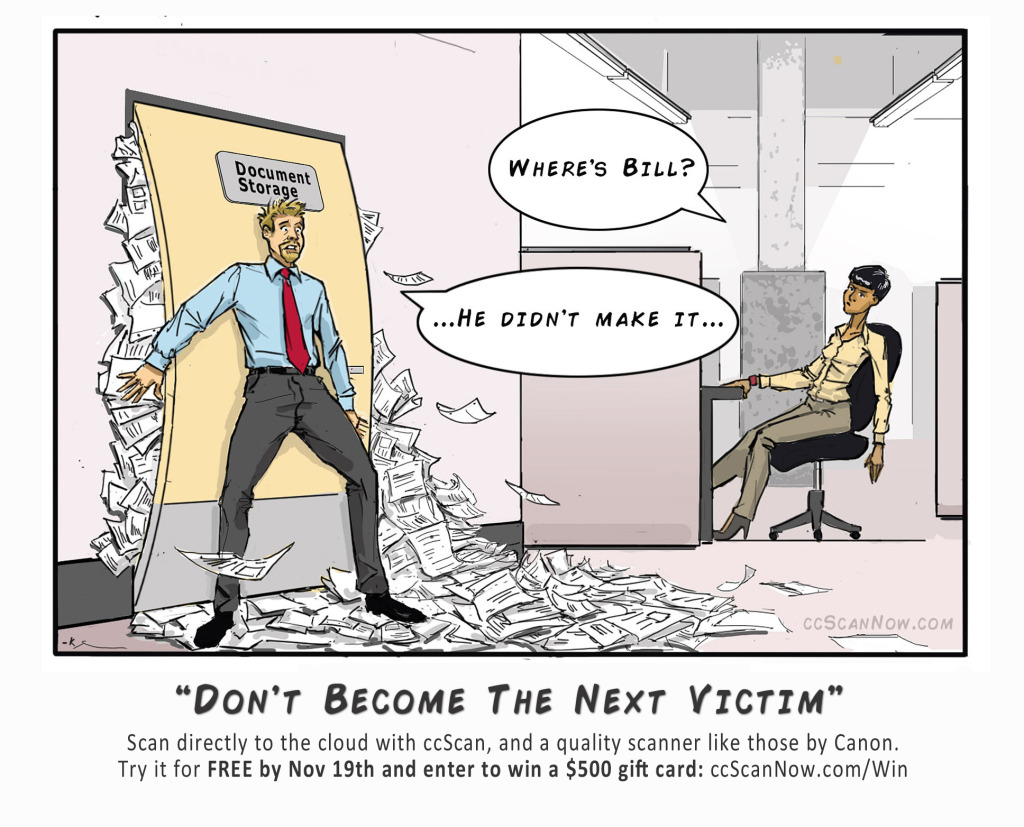
There’s more than one way to do that, of course. Exhale Marketing is currently working with ccScan to create lead and demand generation for their direct-to-cloud scanning software. A traditional campaign would include direct mail, email, and possibly a few paid ads on strategically selected platforms. It would highlight the features and benefits of the program, and ideally point out a few ways that it can improve the work lives of its target market.

Nothing wrong with any of that. But just that is going to fall short of spectacular in the modern age.

Instead, Exhale is focused on the positive emotional connection. The campaign includes both humor – original weekly comics about office life and paperwork (see sample below) – and excitement – a weekly draw and $500 grand prize. To enter, prospects need only download a free 30-day trial of the software. This is something they may have done anyway because of the many benefits it provides, but by framing it with two of the high arousal and positive emotions, it’ll foster even more impressive demand generation.

The product is excellent all by itself, but by including humor and excitement in the presentation, it becomes more appealing, more desirable, and more tempting to try right now, at this moment.

It gets them to your door.

Not sure how to do this for your business? Let’s chat about what Exhale can do for you, from content creation to social management, from original illustrations to stunning graphics, from marketing strategy to execution. At Exhale, we can get them to your door.


read more
ExhaleMarketingExhale @ Work: Demand Generation

The Ideal Blog Post Length

No comments

Falling WordsIt’s kind of the “chicken or egg” debate for the online world: is it better to write short, consumable posts, or long, epic articles? Both sides have staunch supporters. Both sides can spew “data-backed research” to support their argument. So what’s a confused content marketer to believe?  What’s the ideal blog post length?

Well, for starters, it’s important to make a distinction between what each side is arguing. Long posts are good – fantastic – at some things, and short posts are at others. Apples and oranges. Birchbark canoes and vintage game consoles from the 1980s.

Picking a winner depends entirely on what you’re trying to accomplish.


Once Upon A Time in a Galaxy Far, Far Away…

400-500 words used to be the “magic” number for online content. Four years ago (a lifetime in the digital world) that was the norm. Everyone pushed that number…reach 500 words, hit publish, and go on your merry way. Then, someone suggested that 1000 words would be better, and everyone nodded their head and agreed. Next, the “research” suggested that 1500 words is actually the ideal length. Finally, online marketers and content creators discovered that the search engines seemed to favor posts of over 2000 words. And so the slow creep up continues.


The Case for Longer Posts

Google can make or break your website, and by extension, your marketing campaign, promotion, or business itself. You need to rank well with the search engines. And what does Google prefer?

Long posts. “Epic” content. Neil Patel, Buffer, SerpIQ, and a bevy of other online authorities have revealed that Google (and the other search engine players) likes your posts to be long. At LEAST 1500 words, and over 2000 seems to be best. SerpIQ found that the results on the entire first page of a typical Google search were all over 2000 words. Neil Patel saw an increase of 68% in tweets and 22% in Facebook likes for articles over 1500 words. Medium determined the ideal length to be 1600 words (or seven minutes) after examining reader attention on their site.

The “data-backed research” seems to say it all. Longer posts are fantastic for SEO purposes, they generate more tweets, likes, and shares, and they result in more backlinks (crucial to your SEO).


The Case for Shorter Posts

SEO and your SERP ranking are important, but what if you’re more concerned with getting your message out there? With being read and understood?

Is a long post still the way to go? It would seem not.

The average content consumer has an attention span of 8-9 seconds. Yes, seconds. This statistic (often referred to as the “Goldfish” stat because that’s the same as an absent-minded and quick-to-forget goldfish) does not bode well for long, epic posts. Many (most?) people simply won’t read them in their entirety. Typical adults read only 28% of a webpage with 550+ words on it. That’s not much.

A recent experiment revealed that MBA students who wrote short (300-500 words) posts and updated their sites several times per day saw ten times as many visitors as classmates who wrote “epic” content and updated once daily (or every other day). The short, bite-sized, “consumable” content performed significantly better at attracting visitors and keeping them coming back for more. They were actually reading and enjoying the content.

Shorter (aim for at least 300 words…anything less and you run the risk of Google penalizing you for “thin content”) posts allow for frequent updates, are easier to write, and are easier to read. Winning over the search engines (and being favored by Google) is all well and good, but you do want to be read and appreciated by actually people, and not just the Googlebot.

And people, increasingly, want shorter posts. They want visuals to go along with it (one study found the best ratio to be one visual element – images, infographics, videos – for every 350 words).

And if you make the whole thing scannable – using sub-headings, bullet points, and bold print – include share buttons at the bottom or floating alongside, and include “tweetables” (easy to tweet sound bites from the text), you’ll likely see the engagement benefit of longer posts start to shrink.

The sweet spot, despite what everyone seems to believe, just might be the 300-750 word range.

Google loves longer (2000+) posts. People don’t. So, the question shouldn’t be “Which length is best?” but rather “Who are you writing for?”. Know that, and write accordingly.

read more
ExhaleMarketingThe Ideal Blog Post Length

Form Fatigue

No comments

Man sleeping at countryHow long can you hold someone’s attention online? Whatever you’re thinking, cut it in half, and half again. You’re probably still on the high end of the spectrum, but you’re getting closer. Websites and landing pages need to be understood in less than a second. If it’s not immediately clear and appealing, the modern online browser is already on to the next site (thanks StumbleUpon!).

But let’s assume your page does catch and hold their attention. If it’s a typical landing page, you’re trying to collect information that could lead to a sale. And you do that via an online form or survey.

The modern tech-savvy online shopper is all about instant gratification. Fast. Now. Immediately. Their average attention span is eight (8!) seconds (according to statistics verified by the Associated Press). That’s not a lot of time, so you’d better be selective about what you include. If you’ve done everything right up to this point, you have them poised and ready to submit their information.

Now’s not the time to mess it up with a long and overly complicated form.


Form Fatigue

Form fatigue can loosely describe the tendency of modern internet surfers to get tired, frustrated, irritated, and fed up with drawn-out submission forms. If it takes too long, or asks unnecessary questions, you’re going to lose them. They’ll bounce from your site without finishing and submitting their details. Poof! They’re gone.

Deciding what information to ask for might be subjective, but common sense should prevail. Keep it short, crisp, and only collect the crucial details. If you’re trying to grow your email list, would you ask visitors to submit their home address? If you’re collecting information about online shopping habits, would you ask them to list the brick & mortar stores they frequent?

Say it with me: No. No, you would not.

The less you ask for, the more likely you are to get it. It’s really that simple.


The Numbers Don’t Lie

Eye-tracking software allows researchers to get detailed statistics about our internet reading habits, and the findings are very illuminating. The more words you include, the less people read them. According to “Not Quite the Average: An Empirical Study of Web Use”, subjects read only 28% of the words on a typical (550+ words) web page, while that number leaps to 49% on pages with 111 words or less.

The takeaway? Include and ask for only what you need. Limit the amount of words to the absolute essentials.


Long Pages vs Multiple Pages

When collecting information via forms and surveys, it’s not just the number of questions that can negatively influence your success rate.

You have two choices when it comes to either: you can have one long page with many questions and input fields (requiring people to scroll down as they complete it), or you can have multiple pages with only a few questions or input fields on each one (requiring people to manually click to the next page as they complete it). But which is better?

Well, the data isn’t as conclusive or plentiful as that relating to the number of words. However, we do know that slow loading times (the amount of time required for a page to appear) can increase your bounce rate. A one-second delay between pages can lead to 11% fewer page visits (according to the Tabb Group).

Beyond that, observational evidence suggests that people are wary of forms and surveys spread over multiple pages. They have no frame of reference for how long it is, nor can they see for themselves how much further they have to go to finish it. Form fatigue may creep in, and not realizing how near they are to the end, they give up and leave the site.

The Takeaway? It’s generally better to have a long page so visitors can see exactly how much they have left to do (keeping in mind the commandment to ONLY collect the crucial information). Or, if you’re dead-set on using multiple pages, make sure the load time is short, and clearly indicate somewhere along the top of each page how far they’ve come, and how much is left to do.

Form fatigue is real, and it can make or break your campaign. Fight it by keeping everything short, to the point, and if possible, on a single page.

read more
ExhaleMarketingForm Fatigue

Landing Page Split Testing

No comments

Split TestingIn the previous two posts, we examined when you need to use a landing page, and how to create an effective one. Whether you’re using it for a PPC campaign, lead capture, or a featured promotion, you have a particular goal in mind, and everything on the page should be designed to accomplish it.

Everything – the images, the colours, the headline, the main body text – should actively move your visitors to do what you’d like them to do. Typically, that means either clicking through to the next page, or submitting their contact details.

If you’ve utilized the proven strategies mentioned in the previous post, you’re well on your way. Your chances of a successful campaign are good. So you just sit back and wait for the customers to start rolling in, right? Wrong.

Once you’ve created your landing page and it’s “live”, you’re still not done. There’s an axiom about online marketing: Always be testing. Any page you make could always be better. More efficient. A tiny tweak here and there could lead to significantly higher click-through and conversion rates, and that can amount to much higher sales or leads captured. How do you find the best version of any given page? Through landing page split testing (also called a/b, a/b/c or multivariate testing).


What is A/B Testing?

A/B testing refers to a comparison of two or more slightly different landing pages. You have your “A” version (called the control) , and your “B” version (the variation). The basic idea is to use both pages for a set period of time, and then compare their results. It’s crucial that you have an active goal for the test – something that people actually need to do – such as visitors submitting their email address. That way, you have data to measure and compare. You can determine which version is performing better (more people doing what you want them to do). “More visitors” is not a useful goal, as there are too many variables that could affect the outcome, and the differences on each page don’t have anything to do with it (after all, they’ve already landed on the page before they actually see it).


How Do You Conduct an A/B Test?

There are several methods you could use. Some of them are free, and some have a monthly fee (but do offer a more robust and user-friendly experience). Visual Website Optimizer and Optimizely are two of the better known paid services. They allow you to quickly and easily set up, conduct, and analyze tests with little or no knowledge of coding or analytics.

If you want to go the free route, there are many services and plugins available for your WordPress site. Install, and then follow their individual instructions.

A third option is Google Analytics. It provides a detailed analysis of your page traffic, sources, and conversion rates. This method demands at least a general understanding of the service (a topic for another day), although you can use the Google Content Experiments plugin to make things a little easier on you. You can set up basic A/B tests under Behavior-Experiments on the Analytics main page.

No matter which method you opt for, an A/B test follows the same general structure.


Here are five steps you need to complete:

1. Ask a Question
2. Formulate a Goal
3. Design the A/B pages
4. Collect Data (for at least one week)
5. Analyze the Results

A good understanding of landing pages will help you ask the right questions. It’s best to keep things simple, at least for your first few tests. You might, for example, ask whether different short copy on your call-to-action (the text on the submit button) would lead to higher conversions. Or whether an orange button placed above the fold (on the top half of a web page) would yield a higher click-through rate. Or whether a different headline would increase sales.


There’s no limit to the variations you could test:

● Headlines (text itself, one vs two lines)
● Sub-headings (no sub-heading, different sub-heading)
● CTA Text (text itself, on-button vs below button)
● CTA Button (colour, shape, size, placement)
● Images (number, placement, different images vs no image)
● Testimonials
● Social Media (button, icons, placement, displaying share and like numbers)
● Design Elements (colour schemes, framing, amount of whitespace, order of text)
● And much more…

The key is to ask a doable question and designate a measurable goal. Formulate it as an actual question in the early stages. “Would a blue colour scheme with a large orange button yield higher conversions than what we are seeing now?”. Then, create the “B” page, changing only the colour scheme to blue and the button to orange. It’s important to leave everything else exactly the same, so as to know that whatever change you see – either positive or negative – was a result of that variation. Limit your variations to one or two (if they’re small) at the most for each test. Higher than that, and it’s impossible to determine what exactly had the effect.

A typical A/B test will then split the traffic, usually 50/50 (with half of all visitors seeing the control page, and the other half seeing the variation), during the length of the test.


How To Analyze the Data

At the end of the test period, you’ll have enough data to accurately compare the two pages. You’ll want to look at the total number of unique visitors, the conversion rate (how many of those clicked-through to the next page, or submitted contact details, or made a purchase, or whatever other goal you set), and how those numbers compare. If, for example, your control page (“A”) had a conversion rate of 13%, and the variation page (“B”) clocked in at 17%, then you have a 4% increase. You would be wise to make the variation page your new control. It’s performing better. That’s it. You’ve conducted your first split test and acted on the results. A negative conversion lift means you don’t change the page. Simple.


Why Is A/B Testing Important?

It’s a numbers game. Even though the actual difference is only 4% in the above example, that represents a 26% improvement. Would you knowingly turn away 26% more sales or leads?

Look at an even smaller change. Let’s say a control page resulted in a 2% conversion rate, while the variation page saw a modest increase to 2.5% overall. That’s not bad. But what is 0.5% in the grand scheme of things? Again, you’ll want to think in terms of conversion lift, and going from 2% to only 2.5% is an improvement of 25%! And all because you changed the image appearing on the page (for example). Are you starting to see the benefits now?

Smart marketers know to always be testing. Always tweaking. Always experimenting. You’d be surprised at the little things than can result in big, big gains. You want to see your conversion rate going up. You want to capture more leads. You want to see higher click-throughs and sales. A/B testing can help optimize your landing page for maximum results. Find something that gives you a boost, and then ask another question. And another. Always. Be. Testing.


There are plenty of services and tools for conducting A/B tests yourself with relatively little headache or tech knowledge. If you’re still feeling uncertain, contact us and let’s chat about your marketing and how we can help.

read more
ExhaleMarketingLanding Page Split Testing

Recipe for Crafting High Impact Landing Pages

No comments

Marketing Landing Page RecipeLast week, we examined a few common scenarios that demand a landing page. From PPC advertising to lead capture, a landing page lifts your conversion rate and engages your customers, past, present, and future. Without them, you’re shooting in the dark and hoping for the best, rather than setting yourself up to succeed.

While the advantages and necessity of a landing page should be pretty clear, the actual construction still leaves many people scratching their head. How do you make one? What elements should be included?

The first thing you need to remember is that the average internet-user takes mere seconds to evaluate your page. Truthfully, he or she takes less than one second. Rather than frighten you, that should be your guiding principle.


What is the Blink Test?

The Blink Test refers to the fact that most people decide within less than one second whether to stay or leave your page. Quite literally, in the blink of an eye. Does your landing page make it crystal clear why they are there, and how to move forward? If it does, you’ve passed the Blink Test.

A landing page should have one clear, simple goal and call-to-action. No more. No less. It should immediately demonstrate that they are in the right place. If they clicked on your PPC campaign for waterproof socks, that’s what they should see.

So, how do you quickly (remember…less than one second) show them that?


Crafting High Impact Landing Pages – The Critical Elements

1) Your Headline
Your headline should be straightforward and attention-grabbing, appearing at the top of the page, and expressed as a single statement or question. Avoid the urge to simply put the name of your product or service. Instead, a great landing page headline should include the core benefit for them. How will it make their life better? Easier? More fulfilling?

A strong sub-headline, appearing directly underneath, can add to the effect with a supporting statement or evidence.

2) Visual Components
The overall design of your page should adhere to a few proven strategies. First and foremost, keep it simple. You don’t want your page crowded with unnecessary images. Any image or graphic appearing on the page should relate to your topic or end goal. In fact, utilizing blank space is a fantastic technique for highlighting your key benefits or call-to-action. Surround them with white-space so they stand out. If you’re using pictures of people, try and have them looking at your headline or call-to-action. This is a directional cue, and it instantly has anyone visiting your page looking where you want them to look.

Lines (such as pathways and roads) and arrows also create directional cues. Place them to visually guide your visitors.

Your colour choice is also meaningful. You don’t want to give someone a headache because of colour overload. Select carefully. There’s an entire field of study dedicated to colour and how each can affect us. Do some research. Choose wisely. And be aware of the power of contrast. A single, carefully chosen colour scheme throughout is your best bet, and it allows you to then select a contrasting colour for your call-to-action. With it, you can really make your form or submit button pop off the screen.

Finally, be conscious of framing (also called encapsulation). This can be as simple as a box, or literal frame, around your most important details (likely your form and button), or more complex via use of images and graphics that funnel our view. Either way, it’s a mental highlighter.

3) One Clear Goal and CTA
A landing page must have one simple goal. Usually, that’s either the collection of visitor details (name, email address, phone number) or to get someone to click-through to the next page. Don’t overwhelm with unnecessary information. One goal. Provide a few core benefits as to why they should do what you’re asking them to do.

If you want them to click-through, clearly explain how that will benefit them with a few concise bullet-points and a button. Your button text should remind them why they should click it (Save on Waterproof Socks, for example) instead of just saying SUBMIT or NEXT. Be specific.

Likewise, if you’re collecting visitor details via a form, it should be simple, prominently displayed, and easy to fill in. Don’t waste anyone’s time collecting details you don’t need. Name and email address if you’re building an email list. Physical mailing address if you plan on sending out a mailer. Collect only what you need to achieve your goals. And remember to use your visual design to highlight and promote your call-to-action.

4) Trust Indicators
Let’s be honest. Most people have grown wary of giving out their details online. Too much email spam. Too many companies unscrupulously selling user details to other companies.

Your landing page should demonstrate exactly how you are different. You’re asking someone to trust you, so show them why they should. Link to your privacy policy. Include testimonials from happy, satisfied customers (but don’t overdo it…1-3 is perfect, and include pictures). Evidence of sharing and social following is another great asset. It quickly demonstrates that others trust and admire what you’re doing. Eliminate reluctance to provide their details by building trust with them.

5) Resistance is Futile
Okay, this last one might be a little melodramatic. You want your landing page to have one clear call-to-action, and you want to ensure that your visitors follow-through with it. It’s not about being pushy or manipulative, but it is about recognizing certain behaviours and anticipating reluctance.

A landing page is designed specifically to reach your goal. It should standalone and be separate from the rest of your website. Visitors get there by clicking through from your PPC ad, or email campaign, or banner. It’s simple, clear, and straightforward. You provide the benefits to them, and you demonstrate why they should trust you. You make it abundantly clear for them how to move forward by either clicking to the next page in the funnel, or submitting their details. There should be no other option. Don’t include your usual navigation menu across the top of the page, giving them the choice to click to another section of your website before completing the call-to-action. A landing page should have one way off of it… by completing whatever goal you created for that particular campaign. After completing that, they should be taken to a thank you page, or post-conversion page that explains the next step. You’re in control.


Crafting high-impact landing pages shouldn’t be rocket science. Follow the strategies that work. If you’re still feeling uncertain, contact us and let’s chat about your marketing and how we can help.


read more
ExhaleMarketingRecipe for Crafting High Impact Landing Pages

When to Use a Landing Page

No comments

Man QuestionsWe’ve been receiving a lot of questions from clients on landing pages.
What are they?
When would you need to use one?
And how to ensure it’s optimized?

This has inspired our 3 part landing page series.  In week 1 we’ll focus on when to using a landing page, followed by the key elements that make-up a high converting page in week 2 and ending with an article on split testing.


What is a landing page?
A landing page is not simply any page on your website upon which a person can “land” or arrive. Nor can your home page replace a specifically built landing page.

A landing page is a web page that has been custom designed as part of a campaign and around a specific goal. It is often also termed a “lead capture page”, “click-through page” “lander” or “gate page”. I’m sure we’ve missed a few terms, if you have others you’d like to share – be sure to use our comments section!

How landing pages boost your campaign results.
Let’s say your ad states that your company has the best landscaping in Phoenix. I’m in the market for a landscaper, click your ad, and end up on your generic homepage. OK. Um, now what? There’s no obvious next step for me.

A better option is a landing page created especially for that ad campaign, one that lays out your most popular packages, and has a quick form to collect visitor details and follow-up.

(Check out one of our Exhale’s landing pages: http://web.zeuterin.com/findavet/)

When to use a landing page?
From PPC, product specific promotions, offers based on segments of your clients (e.g. those who have downloaded a trial but never purchased), lead capturing to add-on sales, landing pages can be used in every aspect of your inbound marketing.

A well-crafted landing page will dramatically lift your results, while making the path to purchasing more clear for your customers.

4 marketing campaigns that need a landing page.

If you’re using any of the following four strategies, a missing landing page probably means you’re also missing out on sales.

PPC Advertising
Imagine that you see an ad for waterproof socks. You click on the ad and land on a page that is the storefront for a clothing shop. “Where are the waterproof socks you wonder?” A little lost, like the average busy individual, you probably spend no more than 30 seconds looking for something that represents the reason you clicked, before you give up and bounce from the page (bounce = leave.)

Now, imagine if you had clicked on that ad, and to your glee, a new page opened with a wide array of waterproof socks, easy to see pricing, a clear description and a quick purchase option. 5 minutes later, you’d have yourself a few new pairs of socks and that business would be a little bit richer.

Using a proper landing page also lifts your Quality Score with google. As your score goes up, the cost of your ad goes down.

Lead Capture
Every business that wants to grow, needs a great lead capture strategy. Depending on your particular business this can be achieved via several routes (email, PPC, banner) yet one consistent and critical element necessary to lead capturing is a clean and easy to understand landing page.

The best lead capture pages present an easy to complete form (the minimum fields) along with an incentive (see our next section on White Papers and E-books). You may also wish to have a few benefits of what your business brings specific to the target audience you are engaging, but watch you don’t go overboard. This is a version of your website in miniature.

White Papers, E-book or Other Resources
Giving away an e-book, white paper or other resourceschalk full of useful and free information is one of the best methods to collect data and generate leads. Entire companies have been created around this so called freemium model.

A landing page allows you to give away this valued resource in exchange for contact information (name, email, phone). Many companies will use this to gain new leads, re-engage lapsed customers or even build word of mouth. Having a great library of resources to use in campaigns in conjunction with an optimized landing page opens the doors to a multitude of customer engagement options.

Tip – Make them excited about the offer and ensure it is ridiculously easy for them to give their details and get the gift. Plus, it shouldn’t end there, a follow-up drip campaign should be constructed to nurture that relationship.

Featured Promotion
Free Webinar! Add-on Product Savings! Promotion for Returning Customers! Whatever the promotion, one of the best ways to ensure you don’t have clients wandering off course when they go to “learn more” or “purchase” is by using a landing page. This will funnel clients to a page highlighting the features of the promo, specific benefits and make it really easy for them to complete the transaction.

Why landing pages work.

To a marketer, campaigns consist of multiple layers, components and (with the amazing world of automated marketing) moving parts. However, to your customer, it is a roadmap – your first touchpoint being the beginning of the journey inviting them to continue forward.

It’s up to you (or us, if you are one of our clients) to ensure that this story is timely, engaging and relevant enough to keep that customer moving along that map. Plus, that map must be clear – the next steps obvious to your consumer.

Landing pages play an integral role in this customer journey, acting as a marker along the map, keeping your customers moving in the right direction – primed for purchase. Great landing pages will directly affect your conversion rates. Watch next week for our topic on Recipe for Creating a High Impact Landing Page. Can’t wait until then? Contact us and let’s chat about your marketing and how we can help.

read more
ExhaleMarketingWhen to Use a Landing Page